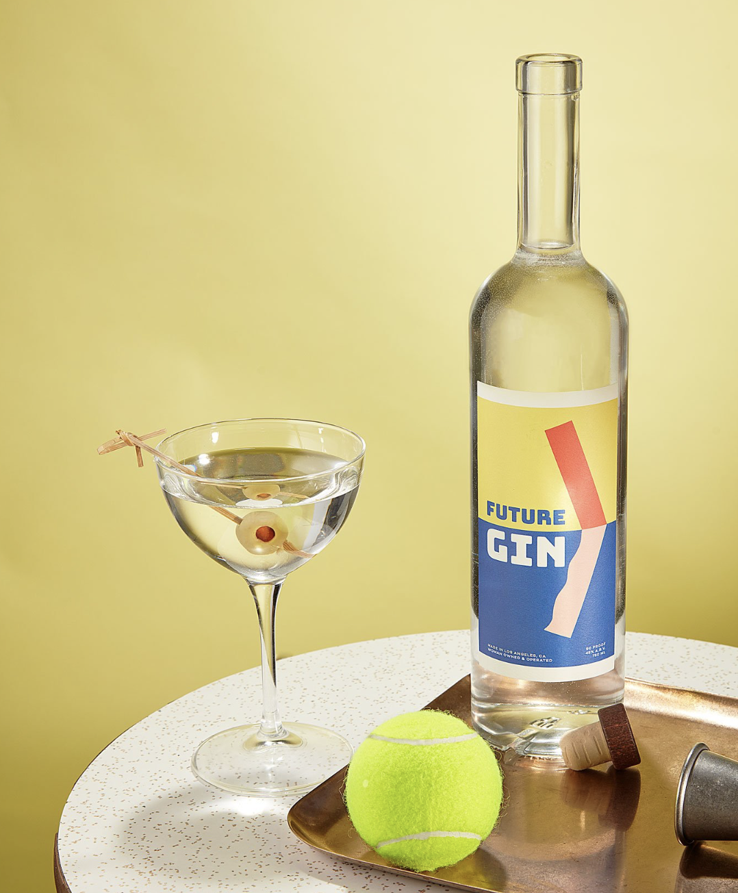
Gin labels are boring. Just that word alone conjures up images of antiquated, complicated and overtly detailed forest animals. When Natasha Case and Freya Estreller (Coolhaus, Bacari)
came to me, they wanted something fresh and ownable that would absolutely scream on the shelves of a dimly lit bar. So I threw everything I knew about gin in a trash can and wiped my brain of any influence.
I knew it needed to be simple and extremely vibrant. Future Gin is a female owned, operated and distilled gin so I also wanted to be careful not to fall into the trap of masculinity.
FUTURE… FORWARD PROGRESS… >
I’ve had people tell me it’s a switchblade (which I like) but it is actually a simple “carrot” (>) as we say in the design world. To make it less sharp, the bottom of the > has
curves graphically representing the female form. The tension between the rigid top, and the soft bottom are reprised by the nuclear primary color palette.


