AWESOME ICE CREAM
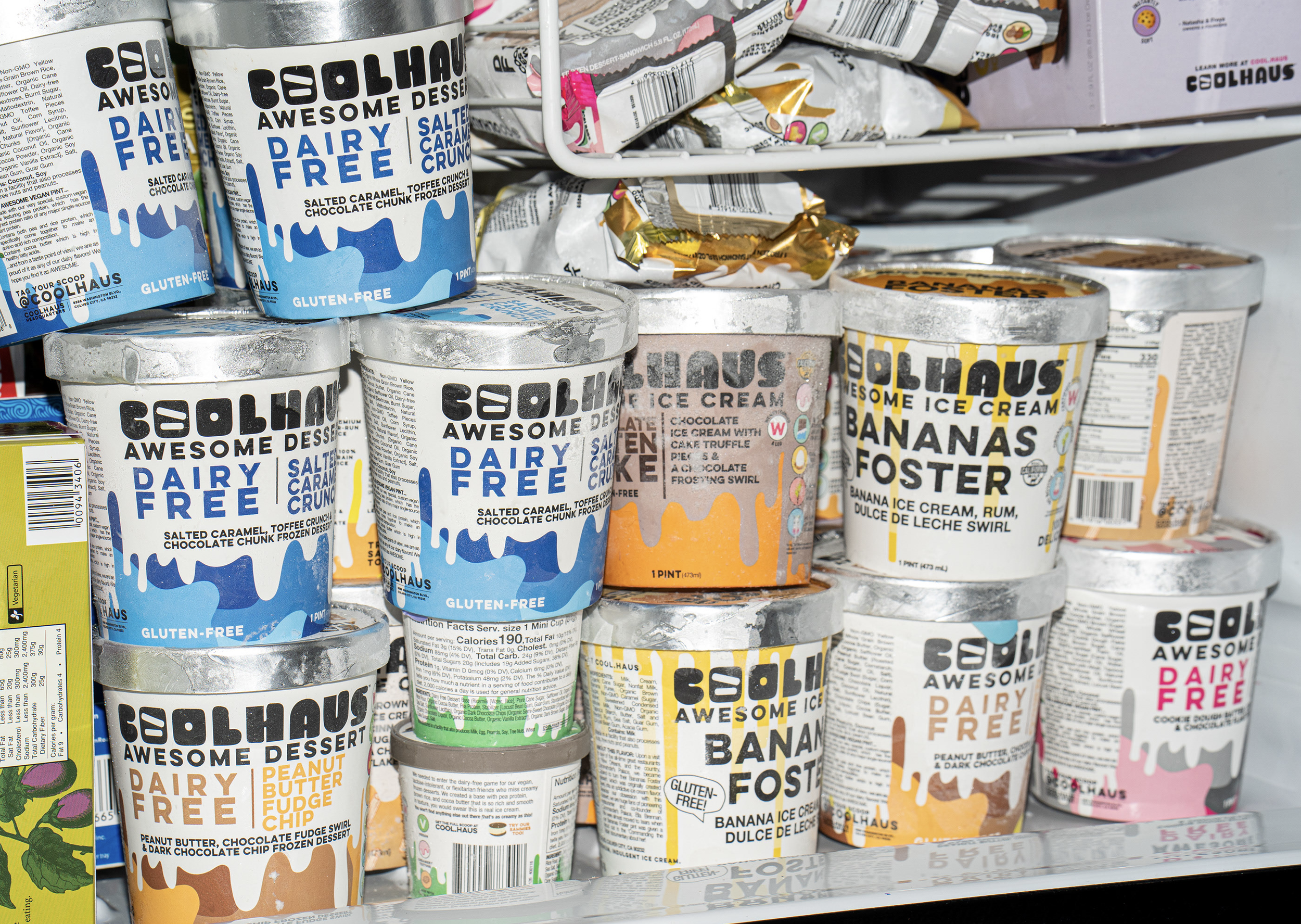
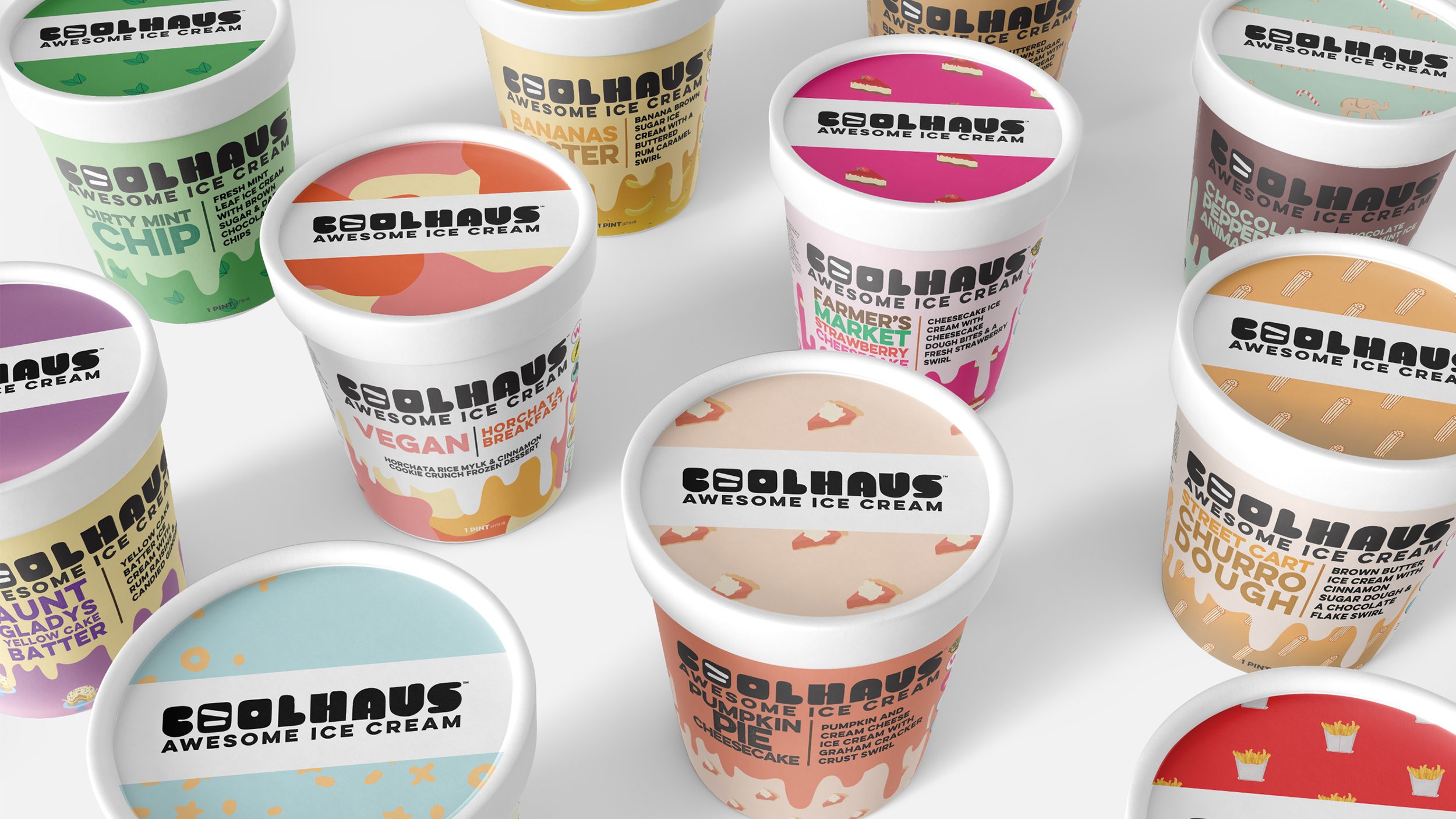
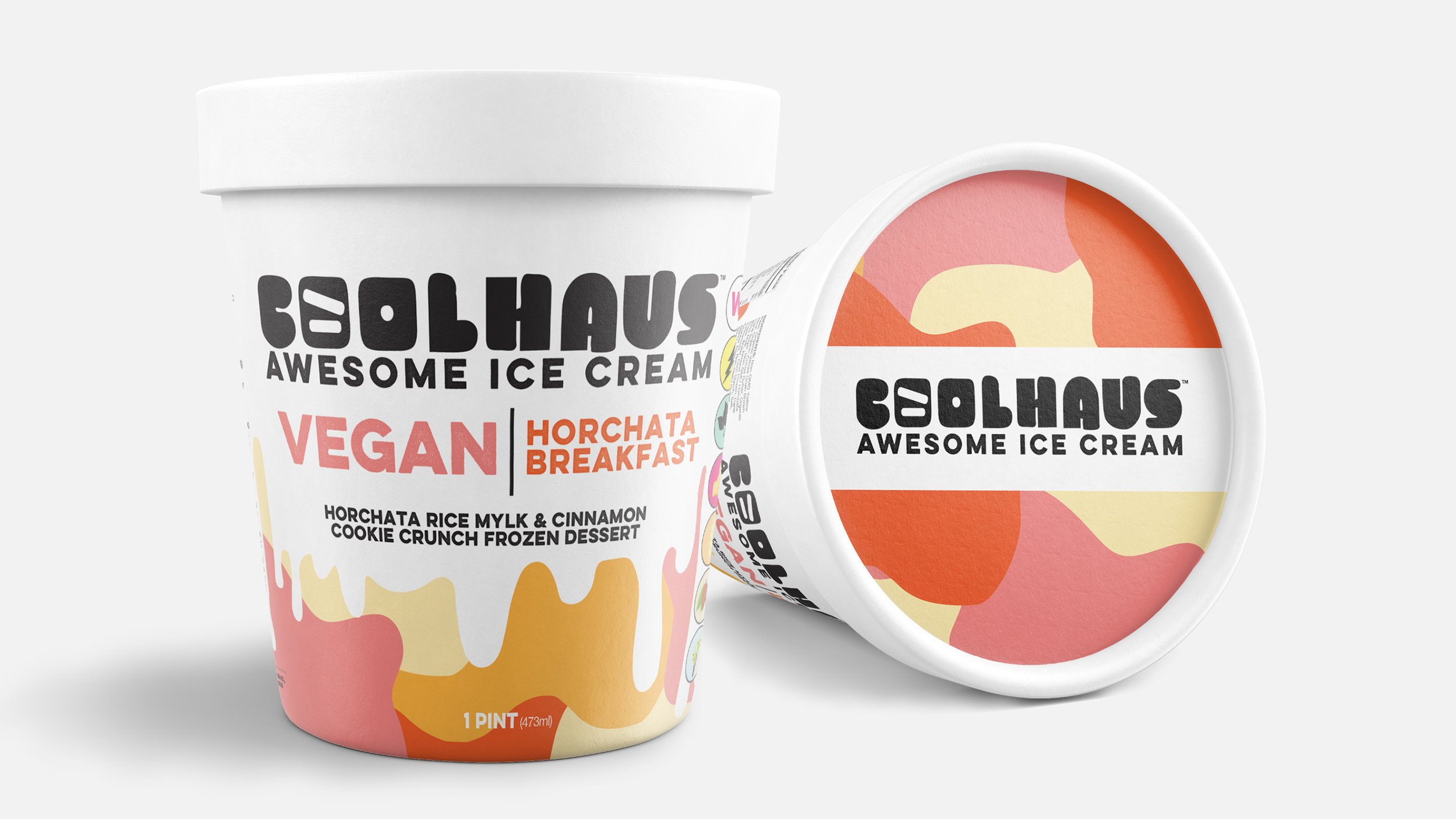
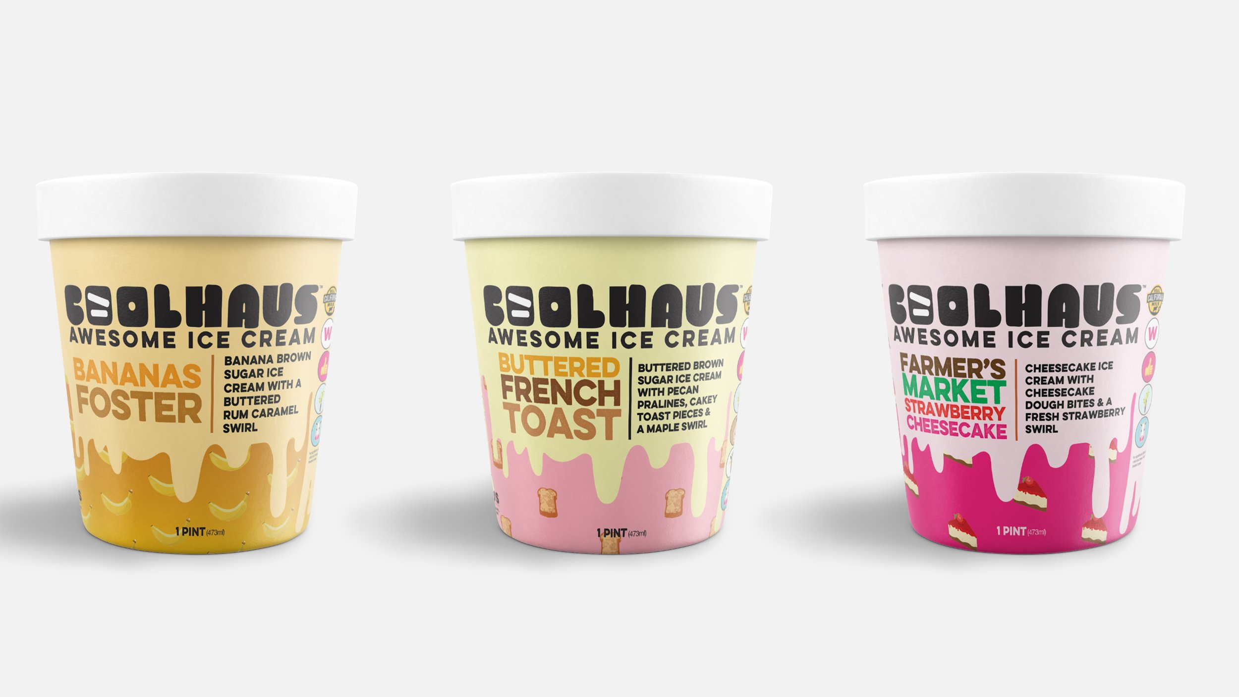
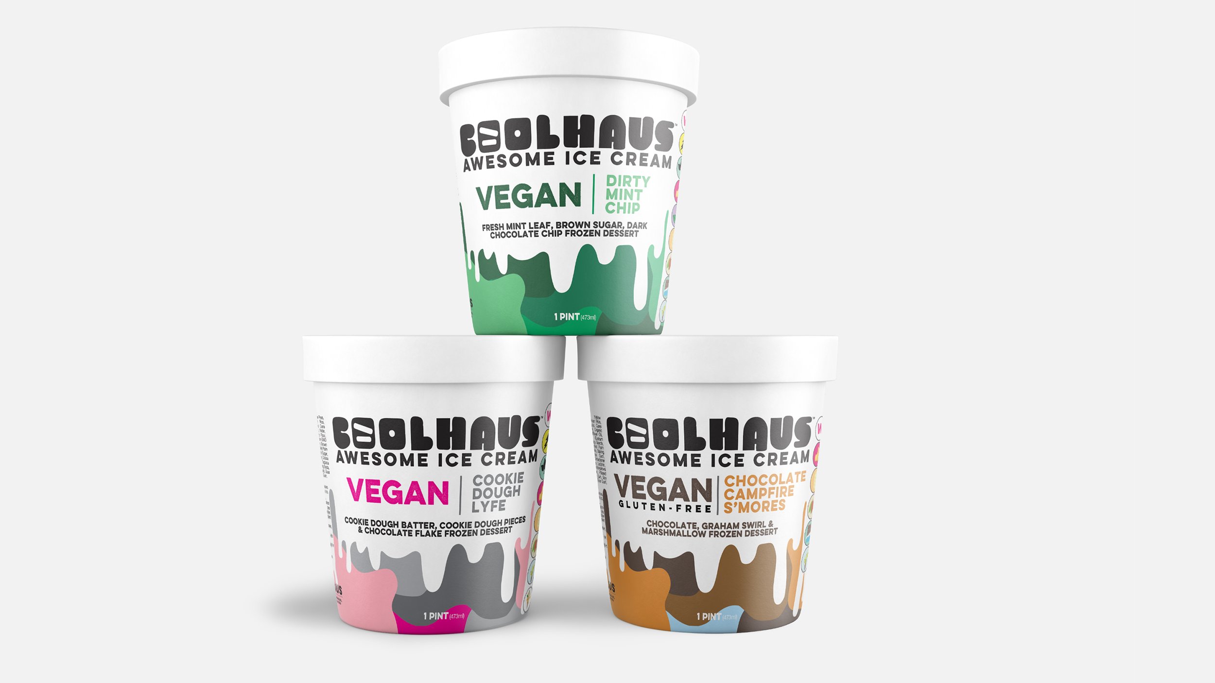
Coolhaus, a Women & LGBTQIA+ founded ice cream company had a typesetting issue. This company has SO MUCH good shit to say about their product, but there just wasn’t enough room on the package. So Natasha and Freya came to me and asked if I could help organize the information as to not overwhelm customers while still allowing their eyes to focus on ket attributes.
The only requirement was that we keep the iconic “drips” coming from the lids of their packaging. I had ZERO intention of getting rid of them but I wanted them to feel “real” and organic. So I got a large piece of white foam core and the darkest chocolate ice cream Coolhaus made - “Chocolate Molten Cake”. Waited for a 90 degree day in Los Angeles and photographed the ice cream beautifully dripping down the foamcore. Those photographs became the blueprint for the graphic drips.
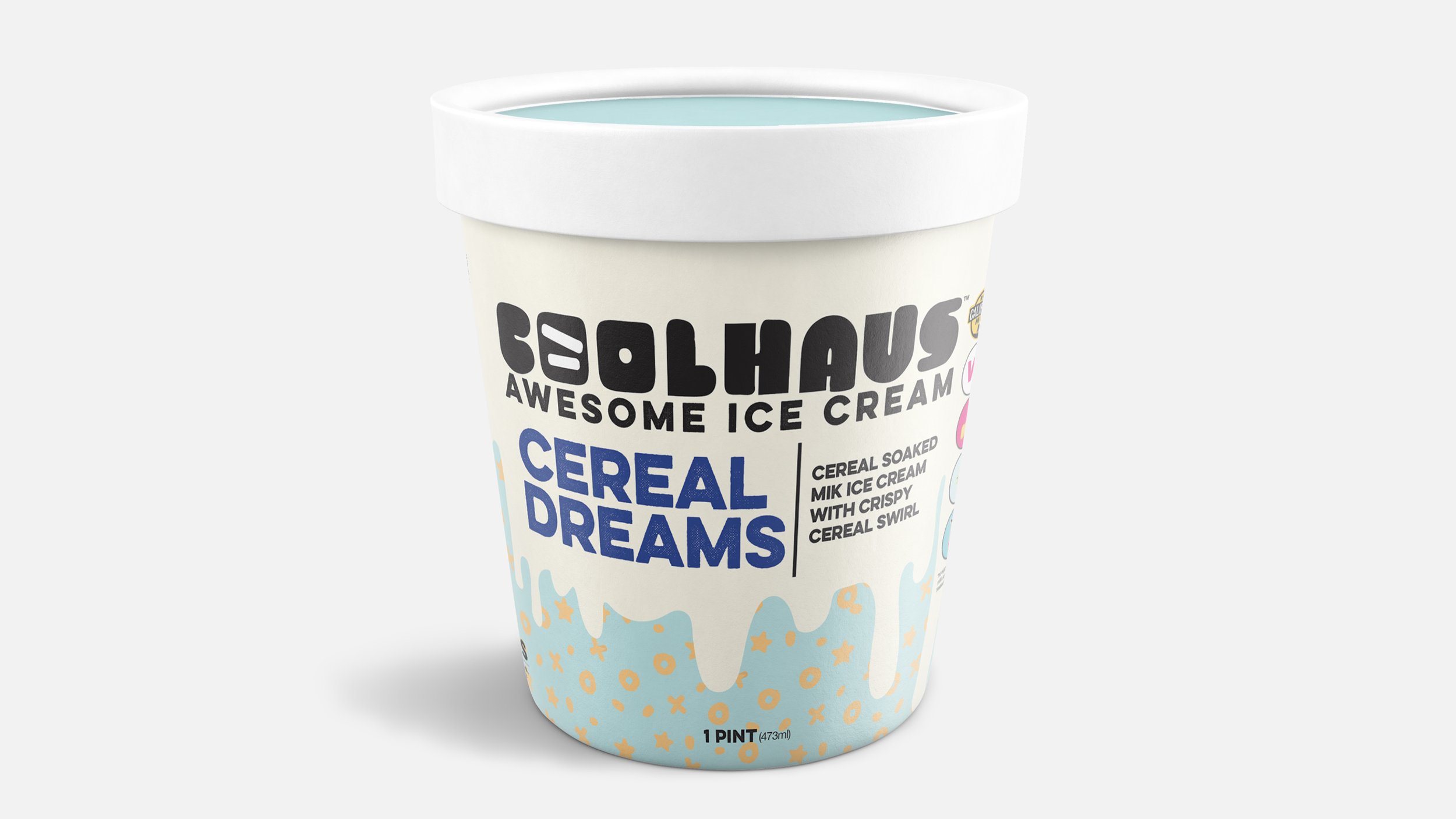
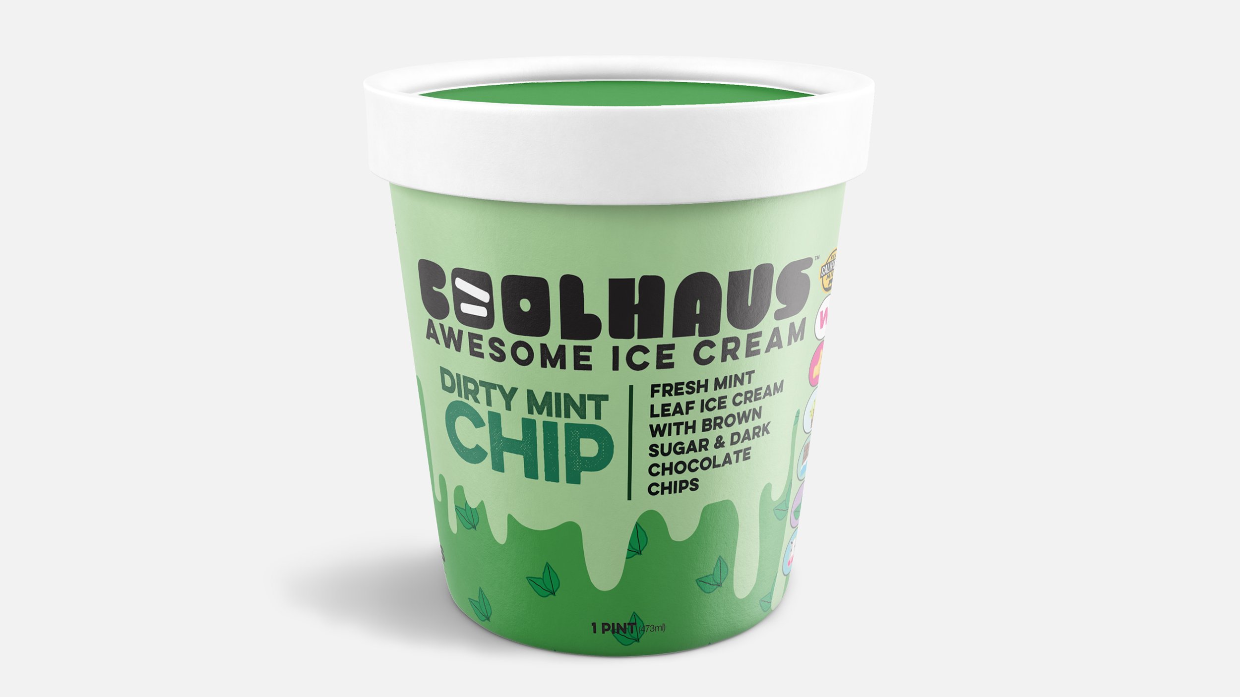
Next was simply an organizational and typesetting exercise. We designated sections to carry secondary and tertiary information and let the brand and flavor be very loud front.
Coolhaus kept this packaging until selling to The Urgent Company in 2021.
